What seasonal color analysis is
Seasonal color analysis is a personal styling framework that maps your natural coloring to a palette of shades that genuinely suit you. The idea is that your skin undertone, natural hair color, and eye color form a combination that harmonizes with certain color ranges and clashes with others. Getting this right means you stop buying clothes in colors that make you look washed out, tired, or off, and start building a wardrobe where most things work together because they share the same underlying tonal quality.
The original 1980s system divided people into four broad seasonal archetypes. The modern 12-season system goes substantially deeper. It recognizes that people within the same family vary along three dimensions. These are warmth (warm versus cool undertones), depth (light versus deep), and clarity (clear versus muted). These three variables combine into 12 distinct types, each with its own specific palette and guidance.
The 12 seasonal types
The four broad families are Spring, Summer, Autumn, and Winter. Within each:
Springs are warm-undertoned with clear, relatively light to medium coloring. Summers are cool-undertoned with soft, muted coloring. Autumns are warm-undertoned with deeper, earthier coloring. Winters are cool-undertoned with high contrast and clear, saturated capacity.
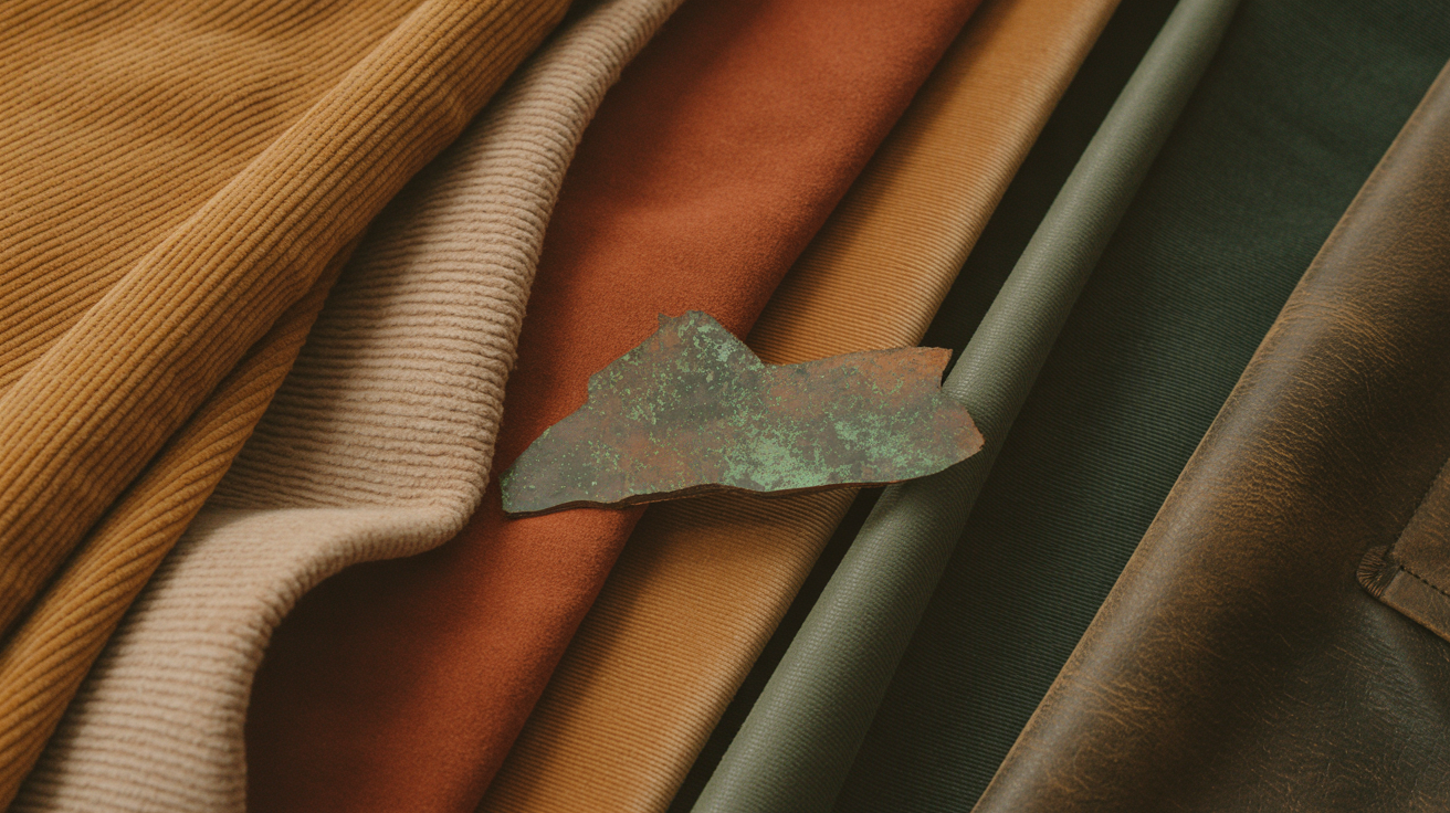
The sub-season distinctions matter more than they might sound. A True Autumn and a Dark Autumn share the warm, muted quality but differ significantly in depth: a True Autumn is overwhelmed by very dark colors while a Dark Autumn carries them easily. A Light Summer and a Cool Summer share the cool, soft quality but the Light Summer needs considerably lower saturation and contrast than the Cool Summer. Getting the sub-season right is what produces recommendations that actually feel personal rather than broadly approximate.
How to find your season
You do not need a professional color consultant to identify your season, though a professional analysis will always be more precise. The About page on Your Season walks through the three self-identification steps.
The first is temperature. Look at the veins on your inner wrist in natural light. If they read greenish, your undertones run warm (Spring or Autumn). If they read blue or purple, your undertones run cool (Summer or Winter).
The second is contrast. Take a selfie in natural light and convert it to black and white. If your hair, skin, and eyes all fall into a similar range of gray, you have low contrast coloring, which points toward the Light and Soft sub-seasons. If there is a stark difference between them, for example dark hair against pale skin, you have high contrast coloring, which points toward Deep, Clear, or True sub-seasons.
The third is clarity. Imagine wearing a bright, saturated shirt. If that kind of color tends to overpower you or draw attention away from your face, your coloring is Muted. If bright colors make your features pop and your skin look more alive, your coloring is Clear.
These three answers together narrow the field considerably. Most people can identify their family and sub-season with reasonable confidence from these observations alone.
What users actually get

The home page presents all 12 seasonal types as a visual grid. You pick yours and land on a dedicated season page built around your specific type.
Each season page opens with the full color palette as swatches, organized by role: power neutrals, soft neutrals, accent colors, and colors to minimize or avoid. The palette section also covers the underlying tonal logic for that season, so you understand not just which colors work but why they work given your specific combination of warmth, depth, and clarity.
Below the palette, the guide covers:
- Clothing neutrals including which browns, grays, navies, and blacks (or near-blacks) anchor a wardrobe for this season
- Makeup by category: foundation undertone, blush families, lip shade ranges, and eye shadow palettes that harmonize with the season's coloring rather than fighting it
- Hair color guidance for both natural color maintenance and color treatments, including which highlights, lowlights, and all-over shades complement the season's undertones
- Jewelry metals and stone tones, since gold versus silver is not arbitrary for most people: it tracks almost directly with warm versus cool undertones
- Product recommendations curated to the season's palette and categories, updated regularly
The product recommendations are non-blocking. The editorial content loads immediately. Product cards populate once the inventory fetch resolves, so a slow connection or any backend latency never holds up the part of the page that matters most.
Building it as a PWA
Your Season is built as a full progressive web app. On Android and Chromium-based browsers it installs via the native browser install dialog. On iOS Safari it walks you through the Share menu approach. The installed experience is full-screen with no browser chrome, behaving like a native app from the home screen.
The install prompt is deliberately delayed by 30 seconds. Prompting immediately, before a user has seen anything, produces very poor acceptance rates. Waiting until someone has had a chance to actually engage with their season page produces much better ones.
iOS and Android need separate handling because Apple does not support the beforeinstallprompt event that makes Android installation straightforward. iOS users see a modal with illustrated step-by-step instructions for the Share menu path. The modal includes proper focus trapping so it is keyboard and screen-reader accessible, and it respects a 7-day dismissal cooldown so it does not reappear immediately if someone closes it.
Once installed, the Service Worker manages the offline experience and the update lifecycle. When a new version is available and waiting, a "Refresh" toast appears rather than silently waiting for the user to close and reopen the app, which could leave them on a stale version indefinitely.
iOS splash screens are included for every major screen size to eliminate the white flash on cold launch. It is a small detail but it is the difference between something that feels like a real app and something that feels like a website pretending to be one.
Why I built it
Seasonal color analysis is well-established in personal styling, but most of the digital resources around it are either locked behind paywalls, buried in forum threads, or presented in a way that is genuinely difficult to use on a phone. The sites that cover it well tend to be desktop-first, text-heavy, and not particularly useful when you are actually standing in a store trying to remember whether your season can pull off a dusty mauve.
Your Season is built to be the thing you open at the rack. Fast, mobile-first, installable, no login required. You know your season, you open the app, you check the palette, and you make the call.
The product recommendations add a layer beyond pure reference. Finding clothes that actually match a specific palette is genuinely time-consuming. Surfacing options that have already been checked against your season's color parameters reduces that friction significantly.
Your Season is live at yourseason.shop. It takes about two minutes to find your season if you do not already know it.